 Gentheme
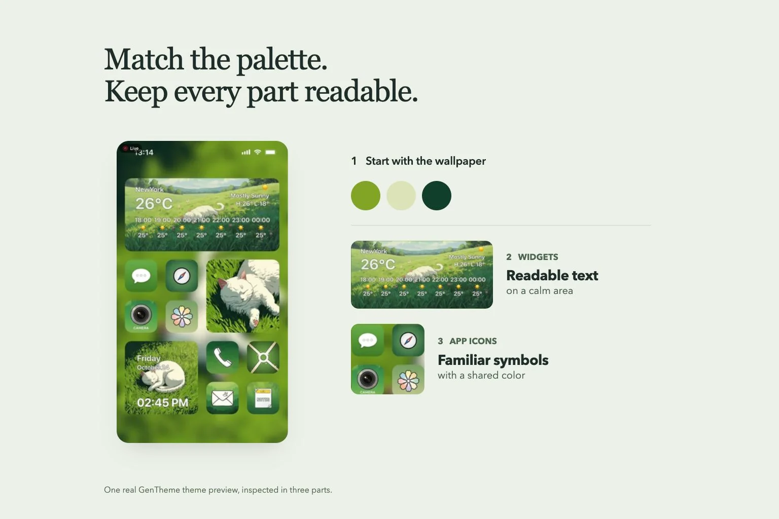
Build a palette from the wallpaper
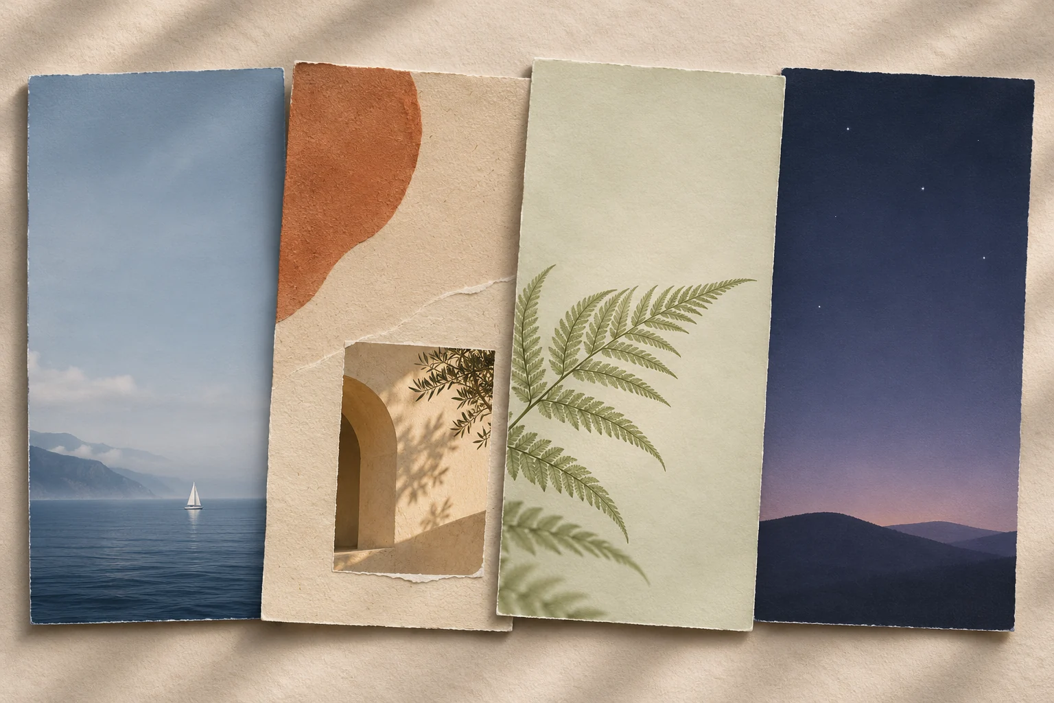
Start with the wallpaper you want to see every day. Pick a quiet base color from a large part of the image, then choose an accent from a smaller detail. Use this as a starting palette and adjust it on your phone.
Repeat the accent selectively in a widget or icon pack. A pale blue sky might work with navy symbols and a cream widget surface. If every element uses the brightest color, choosing where to look becomes harder.
Reserve space for useful content
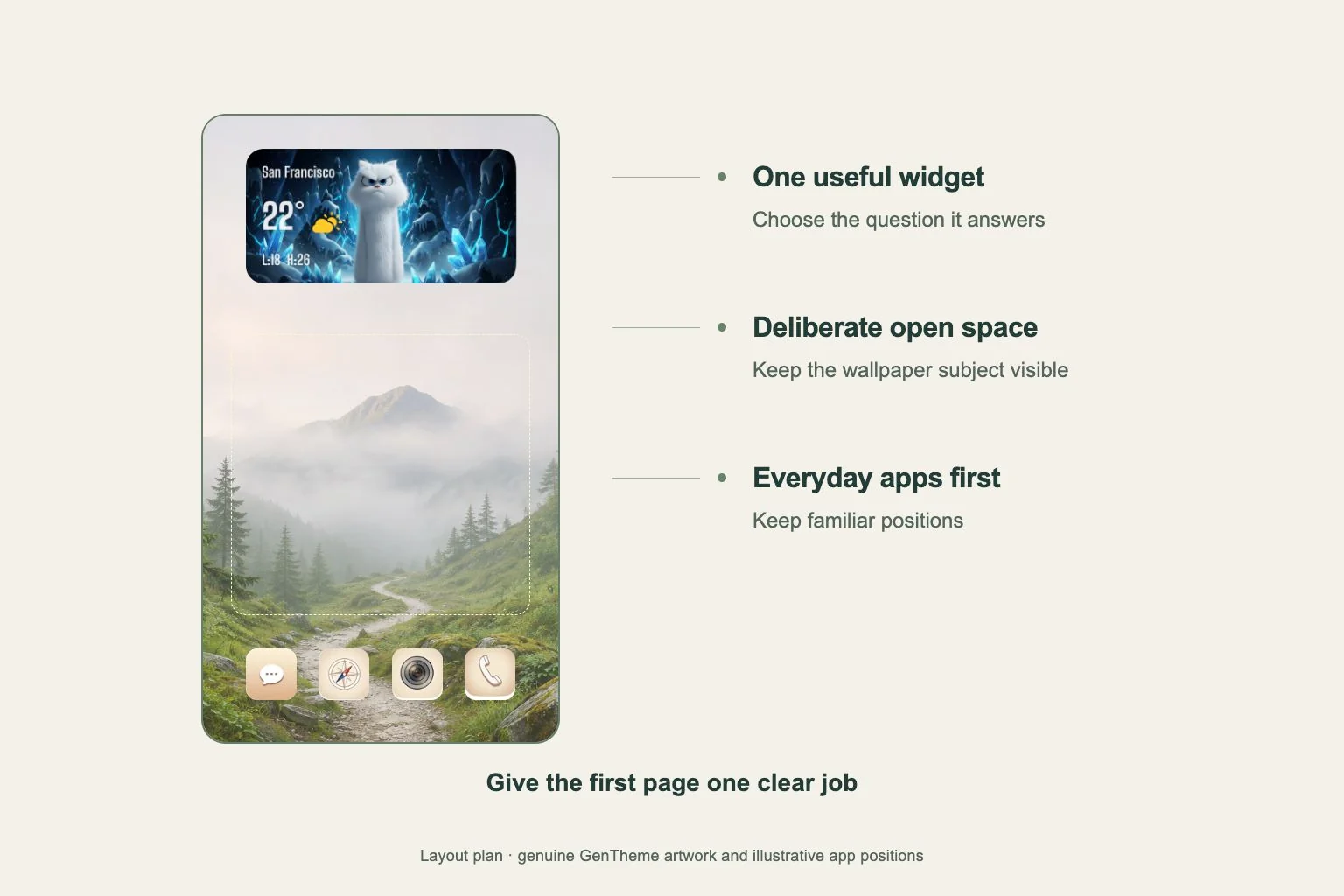
Preview the wallpaper at its final crop. Look for calmer areas behind app labels and widget text. Place a face, flower or other important subject where the layout leaves it visible, then check the Lock Screen clock separately.
Give a detailed widget a simpler background nearby. If the wallpaper already has lettering, avoid placing another text-heavy block over it. Start with the widget you read most often, then leave room around it before adding decorative pieces.
Keep app icons easy to recognize
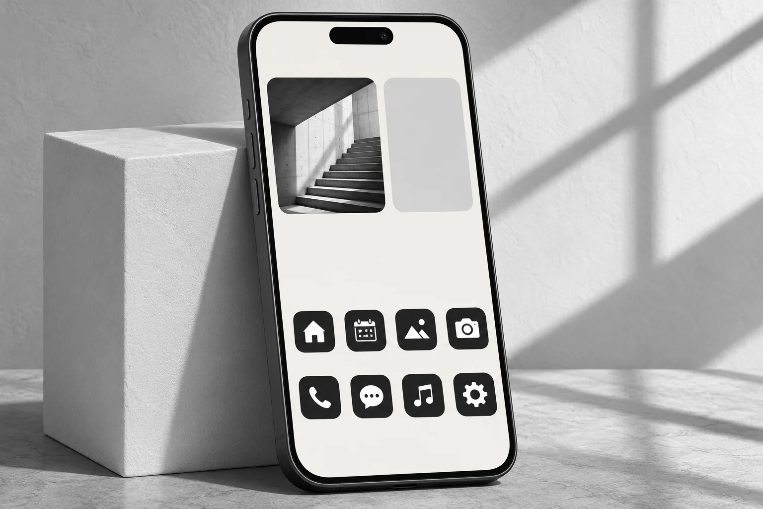
Compare the symbols inside the icons, as well as their colors. A consistent outline style can bring a page together, but similar envelopes, circles and speech bubbles may be difficult to distinguish at normal viewing size.
Keep frequently used apps in familiar positions while trying a new pack. Open each added icon to check its destination. On Android, Gentheme lets you choose the installed target app through the app entry or pencil icon before applying.
Check the three parts on your phone
In a Gentheme theme, Wallpaper, Icons and Widgets are separate installation steps. Finish and inspect each one. On iPhone, icon setup continues through a downloaded profile in Settings. Add a supported widget size, then choose the saved design in its Template setting.
On Android, confirm the icon shortcut requests and each widget addition. For manual widget placement, match the design to the offered 2×2, 4×2 or 4×4 option. Finally, use the page for a few routine tasks and adjust anything you repeatedly misread.