 Gentheme
Choose the balance of black and white
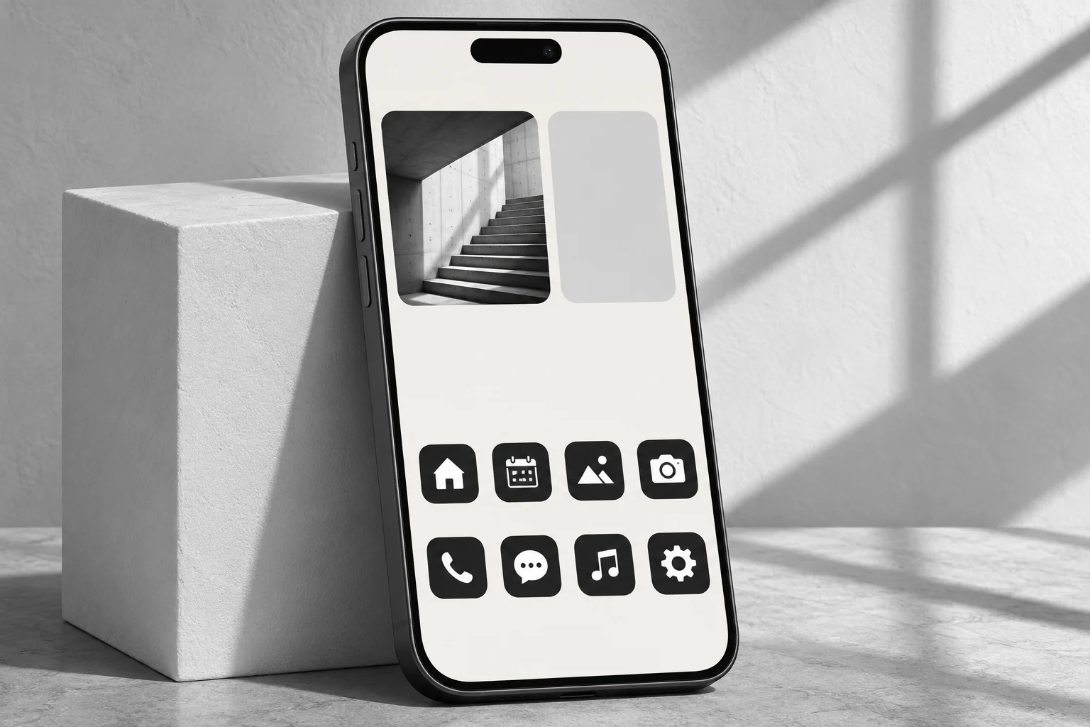
A mostly white page can use warm white #F4F3EF, charcoal #242424 and a little medium gray. A mostly black page can reverse that balance with off-white symbols. Choose the balance before selecting a photograph so its lighting fits the page.
Keep room for middle tones in photographs. A window-lit staircase or a simple building facade has broad light and dark areas. Extreme contrast can erase useful details, especially if several narrow dark lines merge behind small app labels.
Give the photograph one clear job
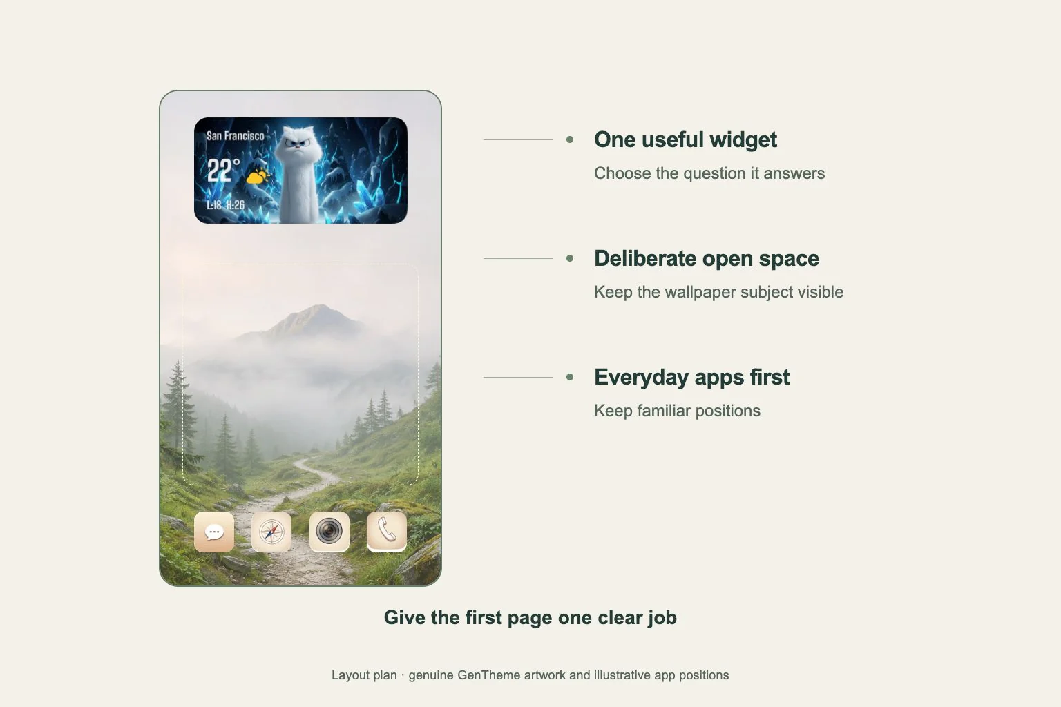
Use architecture to frame an open area, a single flower for an organic shape or a shadow across a wall for a diagonal accent. Check where that strongest shape lands. It can sit beside a widget or beneath the clock with a little breathing room.
If a black-and-white street scene contains many signs, save the detailed version for the Lock Screen. A crop of its plain wall or sky can connect the Home Screen to it. Repeated signs and windows make icon recognition harder when their sizes resemble app symbols.
Distinguish icons without color cues
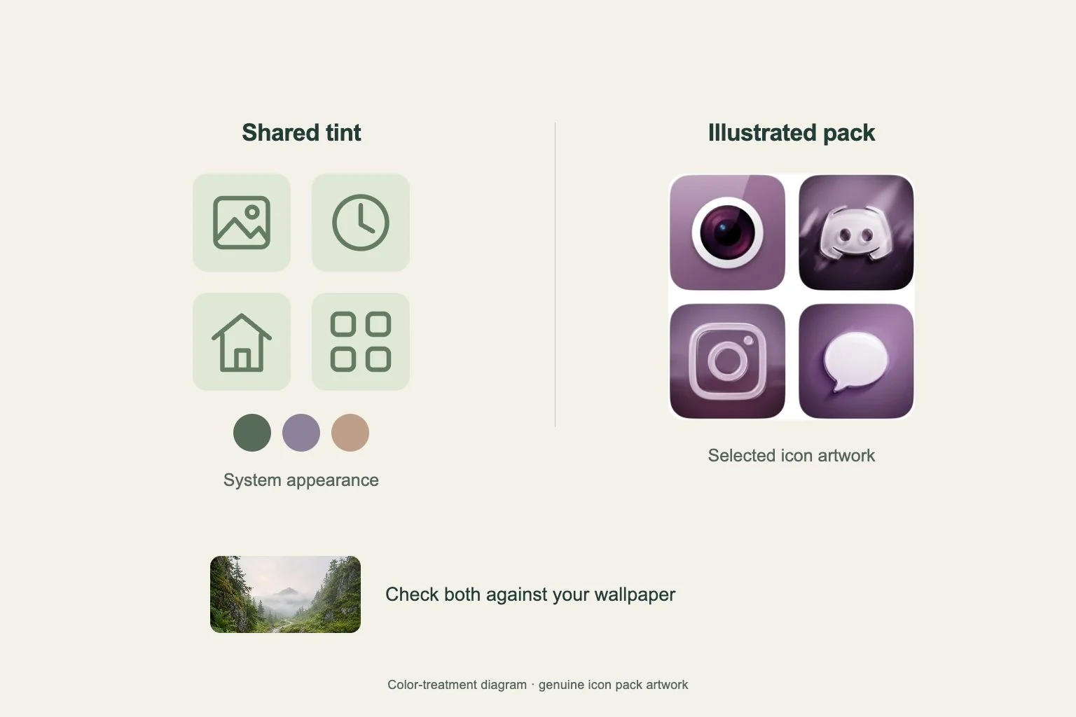
Compare the actual silhouettes in a monochrome icon pack. A filled camera and an outlined clock should be easy to tell apart. Similar circles containing tiny details may require you to read every label, especially during the first few days.
Keep essential apps in the positions you already know. Group them by your daily sequence, such as travel, messages and music, then leave other apps on another page. A consistent symbol weight helps the page feel ordered while labels provide an extra cue.
Review the page as a working layout
Use the Gentheme icon guide to install a chosen pack on your device and check each added icon opens the intended app. Complete the iPhone profile installation or the Android shortcut confirmations before spending time arranging the final grid.
Add one useful widget with clear light and dark areas. Check the date, small numbers and app names at a normal viewing distance. If the photograph competes with them, move its strongest edge away from those areas or choose a broader, quieter crop.