 Gentheme
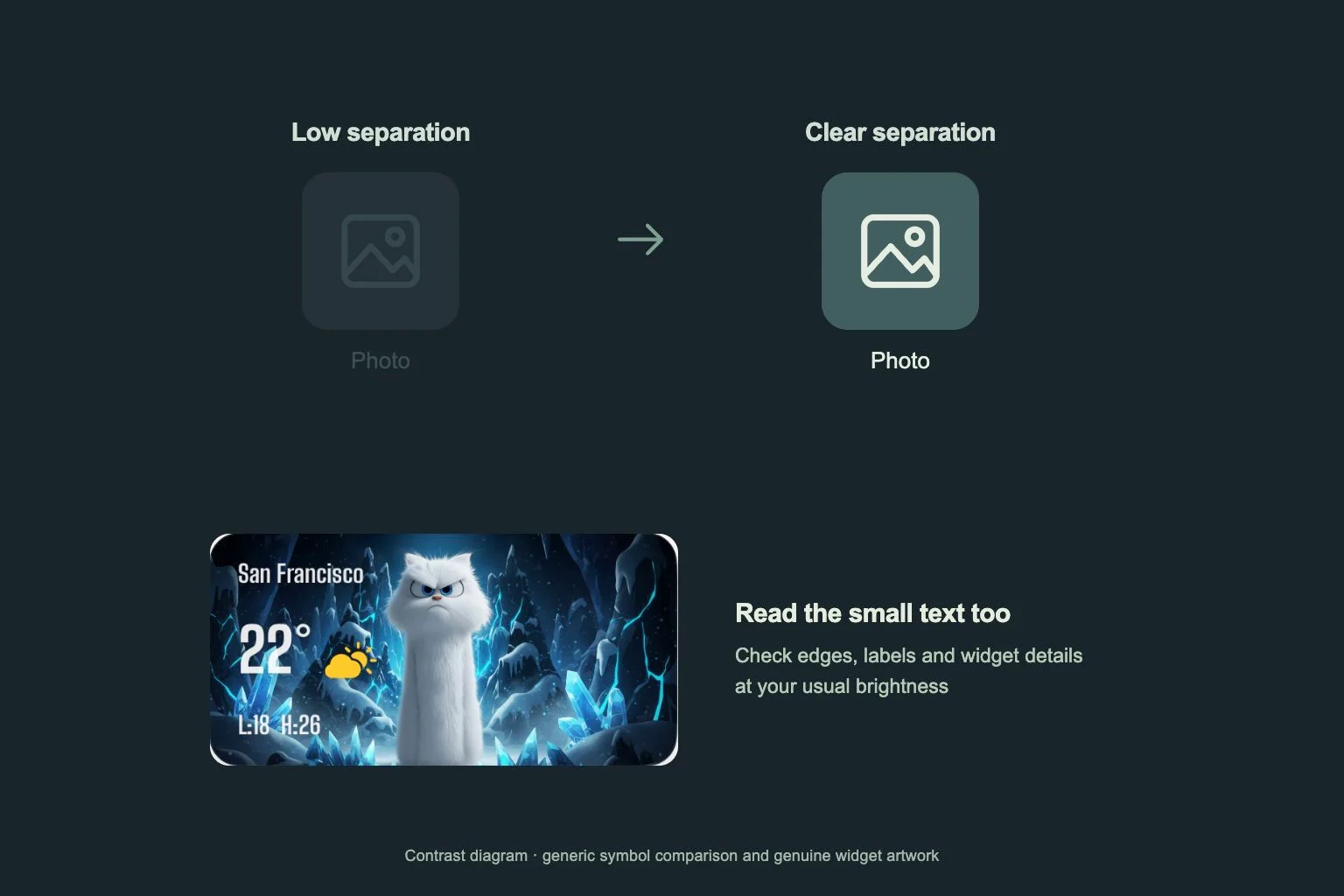
Separate the background from the controls
Start with a dark wallpaper that leaves some difference between the background and the items above it. Charcoal, deep blue and muted plum are useful colors to try. Choose for the way the finished page looks on your device.
Compare icons at their actual size. A dark symbol on a similarly dark tile can disappear even when the pack looks attractive in a large preview. Look for a visible outline, lighter symbol or clearly separated tile edge in the apps you use most.
Inspect text over every part of the crop
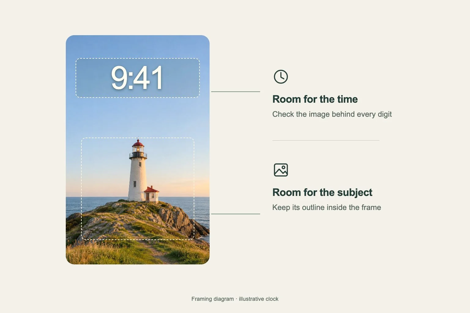
Check the wallpaper after positioning and cropping it. A small bright moon, neon sign or streak of light can fall directly behind an app name. Move the image or rearrange the icons so labels sit over a more even area.
Check the Lock Screen and Home Screen separately. Their clocks, text and occupied areas differ. On iPhone, Customize Home Screen lets you choose a separate Home Screen wallpaper. You can keep the detailed image on the Lock Screen and try a simpler companion behind your apps.
Give widget text a readable surface
Place the widget on the page before judging its appearance. Inspect small dates, thin lettering and secondary details, as well as the largest text. Try a design with a clearer background boundary if the wallpaper texture makes information difficult to pick out.
On iPhone, Gentheme’s widget settings include Background Image, which starts off and can show the full artwork when enabled. Compare both states with your chosen Template. On Android, choose the matching widget size when adding manually, then inspect the result on your launcher.
Test it in the places you use it
Read the page at your usual viewing distance and at the brightness you normally use indoors and outside. Ask whether you can locate your common apps without leaning closer. If a label becomes difficult to see, change its surrounding image area or choose another icon design.
After installing the theme’s separate Wallpaper, Icons and Widgets parts, check function too. Finish the icon profile on iPhone. On Android, verify target apps and confirm shortcut requests. Open the added icons and check widget content before deciding the layout is finished.