 Gentheme

Choose one scale for the space scene
A close planet, a distant galaxy and a small spacecraft create very different proportions on a phone. Choose which scale you want to feel. A large planetary curve can anchor the edge of the page, while a distant galaxy needs enough surrounding darkness to look distant.
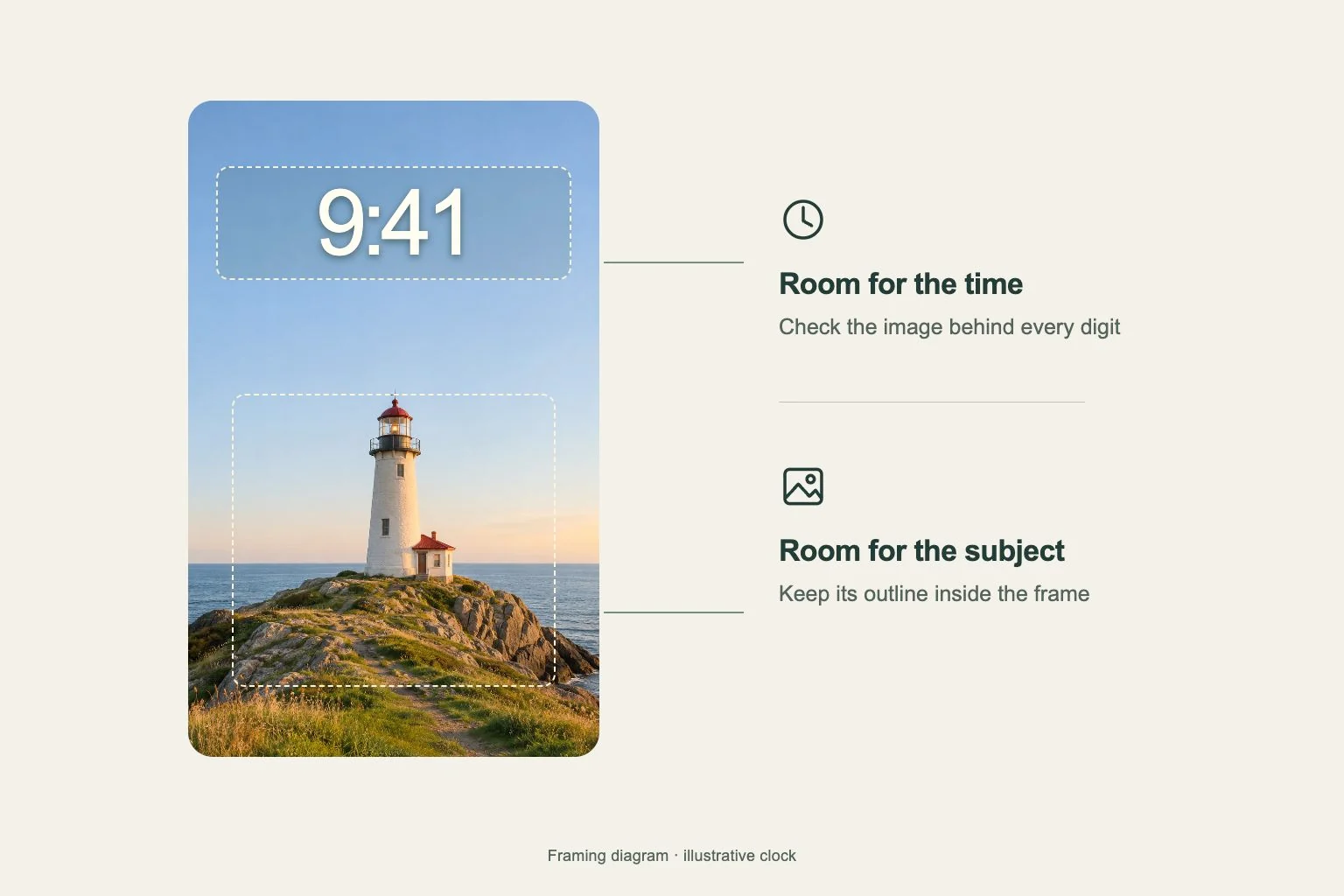
Choose the image you want, then check the portrait crop. If a ringed planet loses both ends of its rings, the remaining shape may become confusing. Leave enough of the curve visible to make the subject recognizable at a glance.
Keep bright points out of reading areas
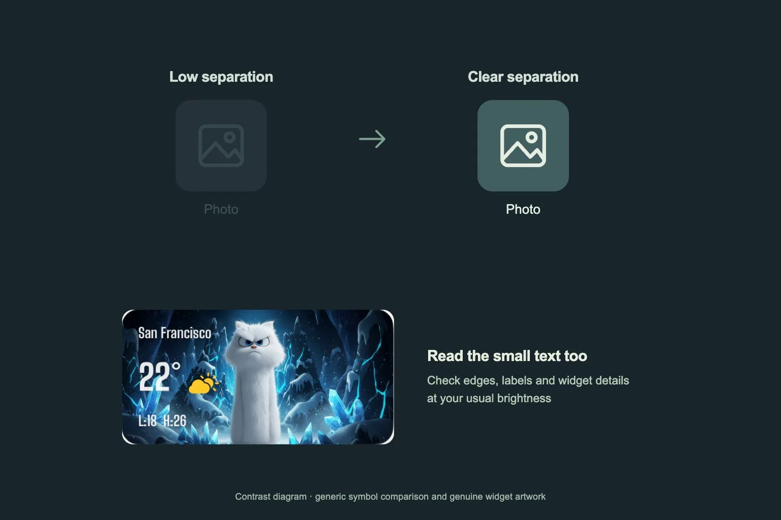
Star fields contain many tiny high-contrast dots. When a star sits inside a letter or numeral, it can look like part of the interface. Compare a sparse field with a dense one using your actual app page, especially around short labels and the edges of widgets.
Try a broad indigo background with one pale planet near a side edge and a few stars in the outer margins. Keep the center more even where your main apps sit. A dramatic nebula can work on the Lock Screen while the quieter companion supports daily navigation.
Coordinate the palette and orbit lines
Pick one color from the space image, such as muted violet, and repeat it in a small widget detail. Keep other surfaces visually steady. Orbit lines should pass through visible open space rather than through several app labels, where their arcs become difficult to follow.
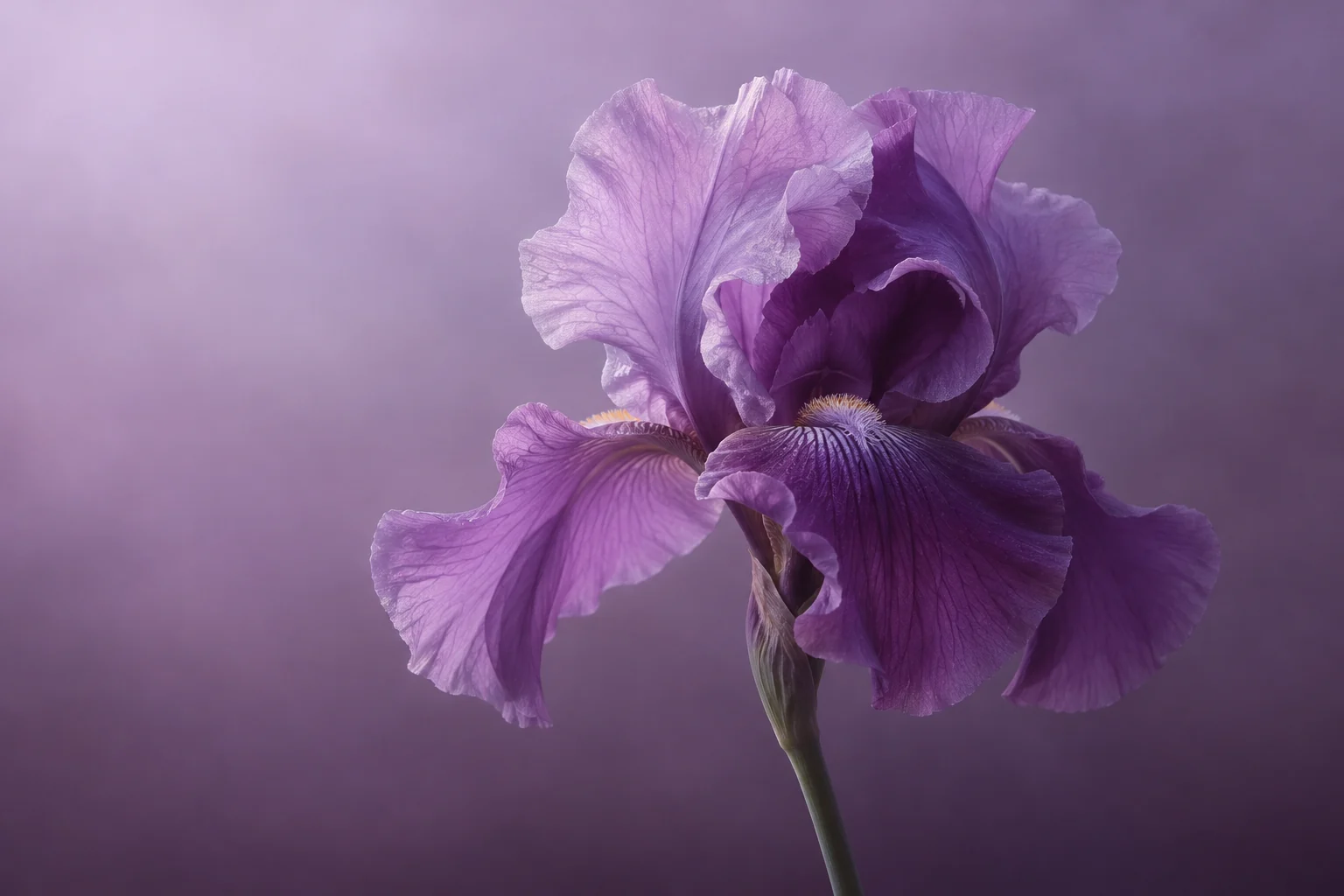
Pinterest’s 2026 report includes a space-inspired visual direction called Extra Celestial. You can translate that inspiration into a restrained silver-and-indigo screen or a soft lilac planet scene. The choice of layout still comes from your image and the space your apps need.
Finish in the system preview
For a Gentheme wallpaper, use the relevant download or apply flow and review any unlock prompt. Check the saved image and your chosen target screen. Keep enough crop margin to move the planet slightly if a system control covers its brightest edge.
Open a folder, return to the main page and read any widget text. Confirm that the wallpaper’s small points are visually separate from badges and app labels. If the page takes effort to scan, compare a less crowded star field before changing the apps you already know.