 Gentheme
Build a palette from the reading room
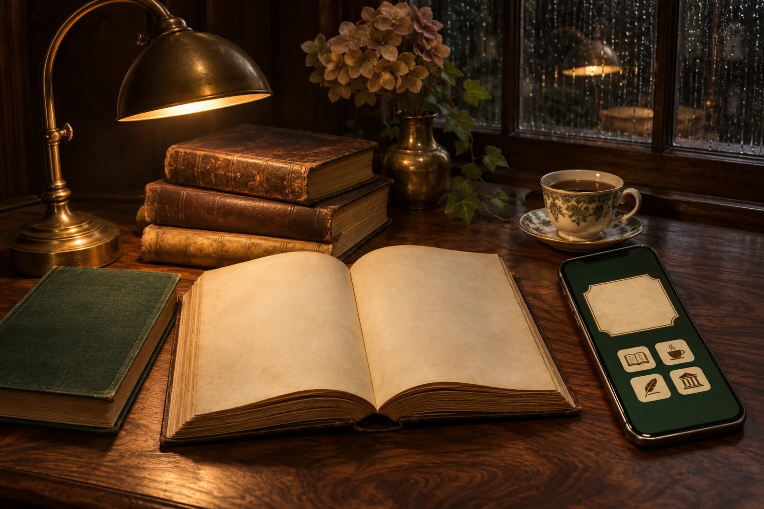
Use walnut brown #3D2B25 as the base, parchment #E7DCC4 for light areas and forest green #263C32 as an accent. A muted brass detail can connect the warm and cool colors. Choose whether brown or green occupies the larger area.
Look for a photograph of one bookshelf section, a lamp beside a book or a rain-dark window. Similar warm lighting helps these subjects work together. A collage containing several different libraries can become busy before you add any apps.
Keep the brightest light away from the clock
A small pool of lamplight gives a dark wallpaper depth. Position it below or beside the clock area so its bright center does not split a digit. Leave enough of the surrounding desk visible to make the light feel connected to a real surface.
Books can form a horizontal band in the lower part of the image. Check whether titles remain attractive when cropped. If the lettering looks fragmented, use the spine shapes or page edges as texture and keep the written content outside the main viewing area.
Use parchment for information panels
A light widget face can resemble a library card while holding a calendar or another useful detail. Choose clear type with enough weight for small numbers. Ornamental lettering is better kept to a short decorative element you can still read at its final size.
Pair dark brown icon backgrounds with cream symbols, or cream tiles with deep green artwork. Keep the daily app positions stable. One framed book photograph can be enough decoration beside the information panel, especially on a smaller phone.
Create a quieter page behind the apps
Keep the atmospheric reading-room photograph for the Lock Screen if it contains many shelves. Choose a related wood grain, dark green field or plain parchment image for the Home Screen. Use the same warm light so the two screens feel connected.
For a Gentheme wallpaper, follow the wallpaper guide to save or apply the chosen image on your phone. Check the final screen after adding widgets and icons. Inspect shadow areas for lost detail and make sure cream text remains clear across each part of the background.