 Gentheme
Choose lilac, violet or plum as the base
Lilac around #C8B6D8 works with soft gray and off-white. A clearer violet around #7460A8 pairs with silver and midnight blue. Deep plum around #4A2E45 can use dusty rose and warm cream. Choose one family before collecting images.
Compare the purple in each candidate photograph. Sunset clouds may lean pink, while mountain shadows may lean blue. A widget taken from the opposite side of that range can feel disconnected. Match the undertone first and use the lighter color only where you want emphasis.
Compose a twilight scene around the clock
A twilight landscape can put dark hills in the lower quarter and leave a broad violet sky above. Choose cloud shapes with gentle edges. Place the palest part of the sunset beside the clock area so the digits do not cross a sudden change in brightness.
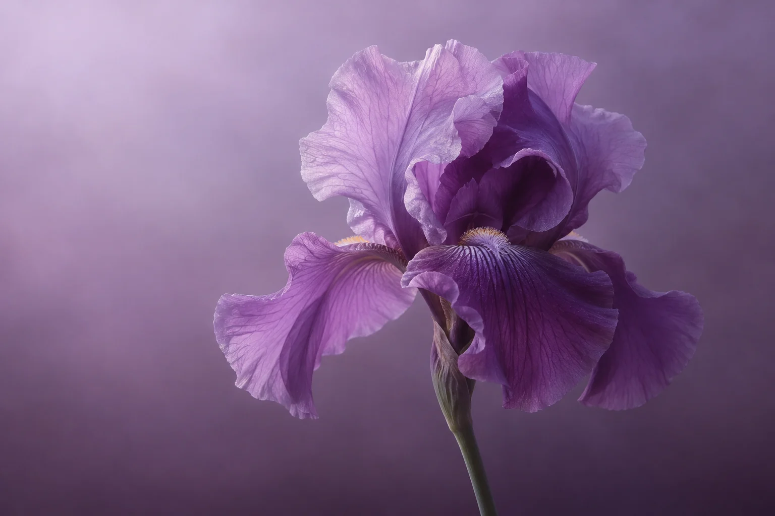
For a floral wallpaper, try one large iris or a small lilac branch entering from the side. Keep the flower’s main outline intact in the crop. A portrait image with space around the petals gives you more flexibility when previewing different screen positions.
Give the Home Screen a calmer color field
A lilac-to-gray gradient can connect to a flower Lock Screen. A dark plum companion can connect to a twilight photograph. Keep the strongest color change outside your main app group and use a plain surface behind any widget with dense information.
Choose icon symbols that remain clear against their own tiles. Silver details suit blue-violet, while warm ivory can soften redder plum. Use one small photo widget if you want to repeat the flower or clouds, and leave the rest of the purple background visible.
Inspect the shadows and soft transitions
Open the saved image and check whether dark hills retain shape and pale petals retain detail. Inspect smooth violet skies for bands. A very dark thumbnail can hide an indistinct foreground, so review the image at its intended size before finishing the layout.
When choosing a Gentheme image, follow the wallpaper guide for your device. Set the saved image or complete the offered apply flow, then inspect your actual clock and app labels. Adjust the crop if a bright cloud or pale petal makes a small part of the page harder to read.