 Gentheme
Set the dot size against the icons
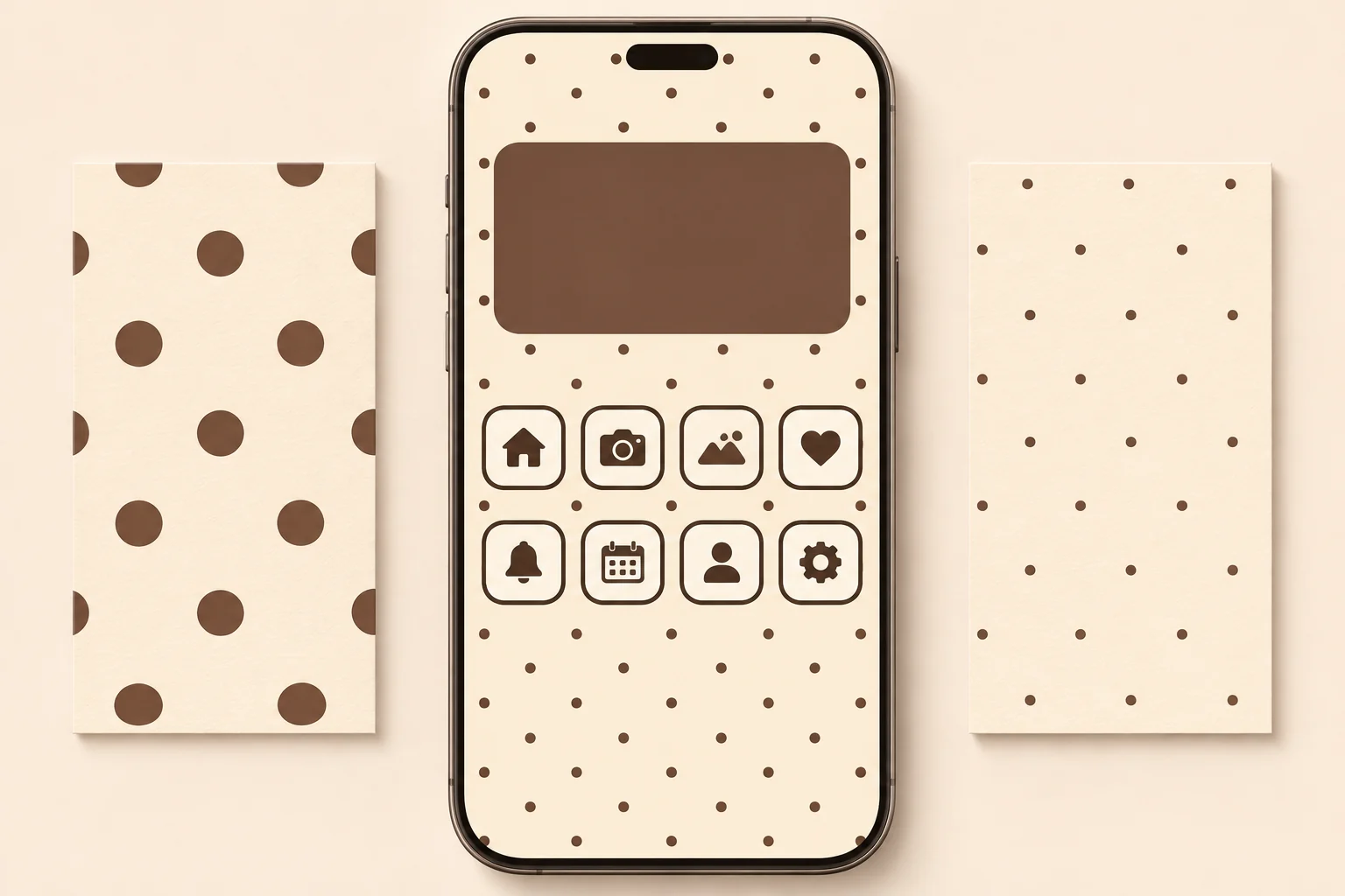
Open the wallpaper preview with your app grid visible. As a starting point, try dots around one-sixth to one-quarter of an icon tile’s width. This keeps the pattern visible while giving the icons a different scale. Check the result on your own screen.
For a quieter look, choose smaller dots with more background showing between them. Oversized dots can become bold circles cut by the screen edges. If that is the effect you want, use only a few circles and give each one a deliberate position.
Choose regular rows or a loose arrangement
In a regular pattern, try a gap of two or three dot diameters between neighboring dots. Preview whether a row seems to underline every app name. Slightly shifting the wallpaper crop can change that alignment, so check the final page after applying it.
A loose arrangement can keep the area behind a widget less crowded. Look for uneven spacing that still feels balanced across the screen. Watch for accidental clusters in the corners, where cropped dots can look heavier than the full ones in the center.
Control contrast with a two-color palette
Try cocoa dots #705747 on cream #F6EEDD for a warm version, or deep blue #345168 on pale blue #E6F0F5 for a cool one. Two colors give the pattern a clear identity. Use one of them again in a plain widget.
Keep icon symbols strong enough to stand apart from the dots. A plain icon background can help separate the two layers. If the pattern is high contrast, choose a low-detail widget face and inspect the small text where it sits beside several dots.
Make a matching pair and check the edges
A larger-dot Lock Screen can pair with smaller dots or a solid companion on the Home Screen. Keep the same two colors across both. Inspect the top edge around the clock and the bottom edge near the dock for distracting partial circles.
Use the Gentheme wallpaper setup guide if you choose an image from the app. After setting it, view the page with your normal apps and widgets. If dot rows cross labels or imitate icon shapes, adjust the crop, reduce pattern density or choose a quieter companion.