 Gentheme

Choose a narrow color range
A minimal gradient works well with two related colors and one transition. Try dusty lavender #B8B0CC moving into slate blue #657C9A, or warm cream #EEE4D4 moving into clay #C49D89. Keep the colors close enough that the transition feels continuous.
Decide whether the page should feel cool or warm before adding icons. A neutral gray symbol set can work with the lavender-blue version. Dark cocoa symbols can connect to the cream-clay version. Use the same temperature in any widget background.
Move the light to support the layout
A vertical gradient can put a lighter area above the apps and a deeper shade near the bottom. A diagonal version can guide attention toward a photo widget. Compare both with your actual clock and app labels visible, because the brightest area changes their contrast.
For a soft glow, look for a broad transition with a gentle center. Keep a bright spot away from small pale lettering. A glow placed under a plain widget can also outline its edge, so check whether that extra emphasis suits the information inside.
Inspect the gradient for banding
Open the saved file at phone size and look across its quiet areas. Visible rings or stripes interrupt the smooth transition. A small thumbnail may conceal them. Repeatedly saving a compressed image can also introduce rough patches in what should be an even field.
If you are making your own image, keep the original export and compare it directly with any transferred copy. Very fine texture can soften the appearance of banding, but it also changes the clean look. Choose the version whose surface you prefer on the actual screen.
Keep the remaining elements consistent
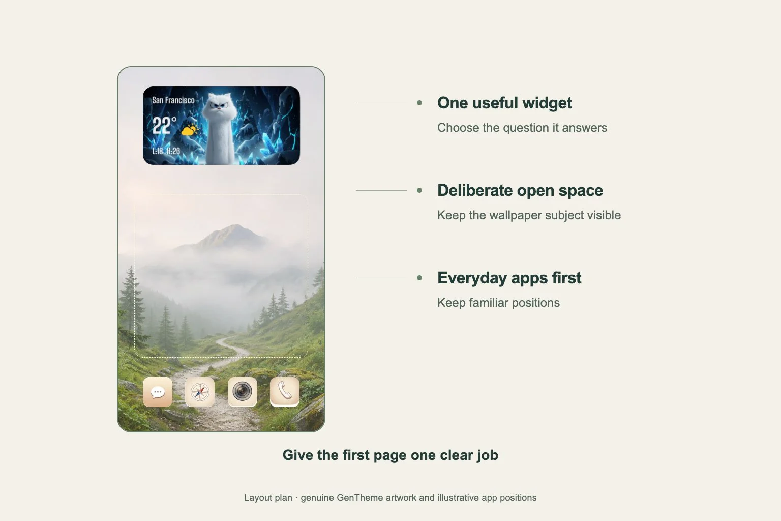
Use one icon background style across the first page and limit decorative widgets. A calendar or other information panel can supply a clear rectangular anchor against the soft color. Leave enough gradient visible to show the direction of the transition.
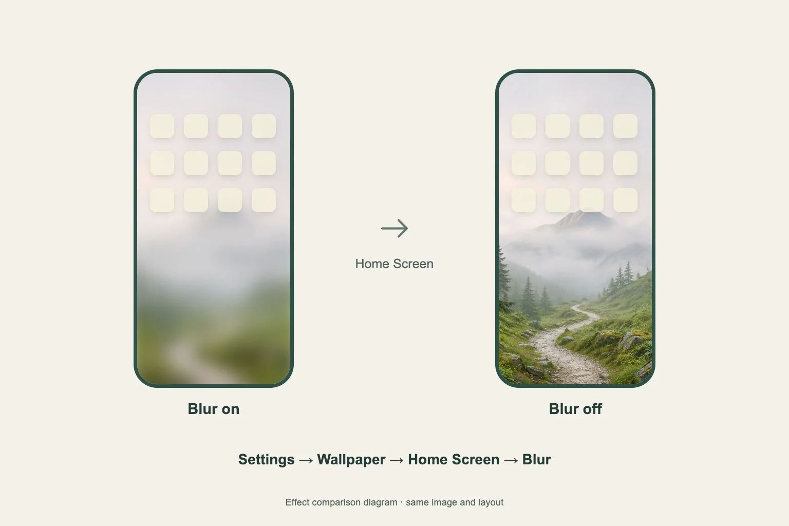
Follow the Gentheme wallpaper guide when saving or applying an image from the app. Preview the final Home Screen after setup and check the names in both light and dark portions. Adjust the crop if it moves a pale patch directly behind your most-used labels.