 Gentheme
Start with a polished green surface
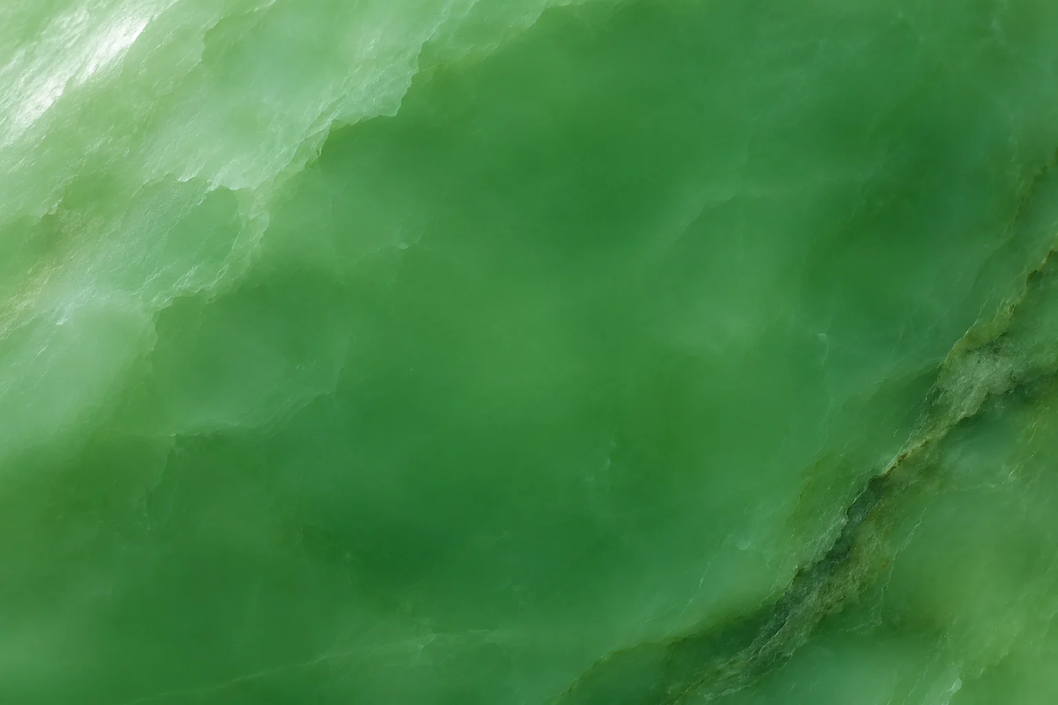
A jade-inspired wallpaper can draw on smooth mineral color and a soft surface sheen. Choose an image with broad green areas and a small amount of cloudy variation. The texture should remain interesting at phone size while leaving space for the interface to sit above it.
Compare a pale celadon direction with a deeper saturated green before choosing one. Treat the picture as a visual material study. A digital wallpaper’s appearance cannot identify a gemstone or its quality, and you can choose the color simply because you like it on your screen.
Place variation near the edges
Look for a cloudy patch or darker curve that travels along a margin. It can give the image movement while leaving the clock area more even. A strong light streak crossing the middle may look attractive in a gallery and become distracting behind a row of app names.
Try a crop where the lightest patch sits below the date and outside the main clock digits. Keep one recognizable transition from pale to dark green. If you zoom until only a tiny fragment remains, compare the full image again to see whether the stone still has useful depth.
Choose companions by contrast and surface
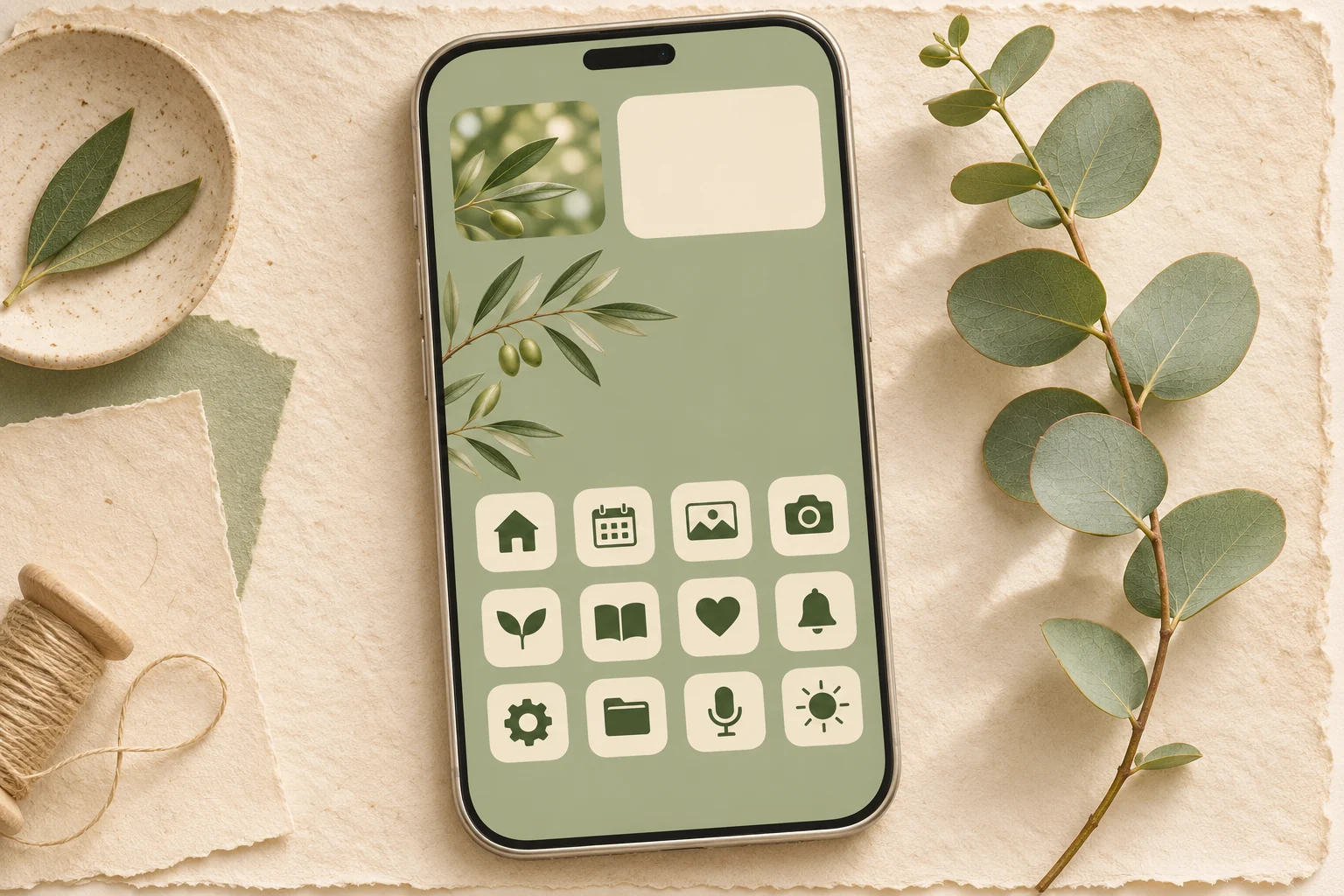
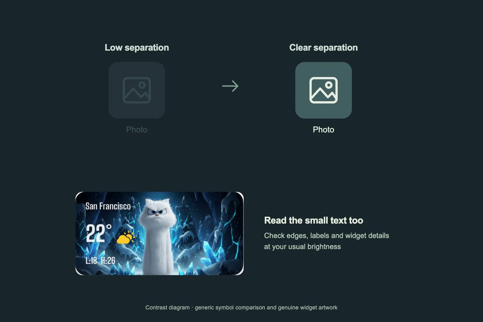
Warm ivory can make green feel softer, while charcoal gives the same wallpaper a more defined edge. Try one of those tones in the available icon or widget design. Keep the symbol shape clear so the shared palette does not turn several everyday apps into similar-looking tiles.
Avoid adding another highly veined material on every panel. A plain widget surface can give small dates and secondary text a steadier place to sit. Test a polished background beside a matte panel and inspect their boundary at the brightness you normally use indoors.
Preview the material after applying it
When you find a suitable Gentheme wallpaper, follow its device-specific download or apply flow and review any unlock shown. Confirm the saved image and its resolution before opening system wallpaper settings. Inspect the selected crop with the actual clock and app page visible.
Check whether the green shifts too dark around labels or too pale behind white text. Make one adjustment at a time, such as moving the crop or changing the companion surface. Keep the wider original so you can try the same material on another screen proportion later.