 Gentheme
Start with the wallpaper you will keep
To coordinate Android wallpaper and icon colors, apply your chosen wallpaper first and check your phone’s available color and icon settings. Those controls vary by manufacturer, Android version and Home Screen app. Use the instructions for your own launcher when its menu differs.
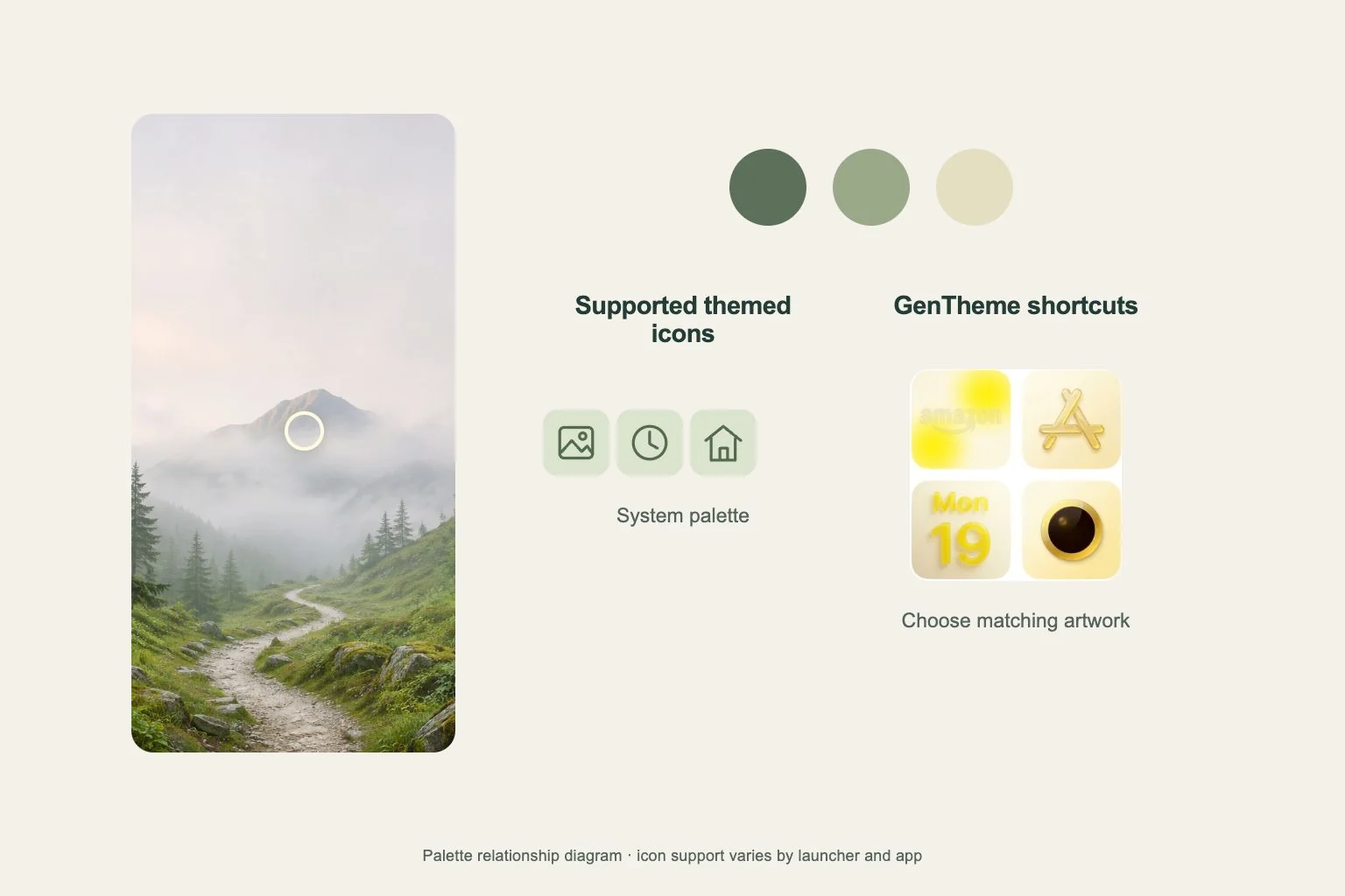
On a Pixel, touch and hold an empty Home Screen area and open Wallpaper & style. Google documents color palettes related to the current wallpaper and options for other colors. Check the preview and apply your choice before deciding that the icon artwork itself needs replacing.
Check which icons respond to system styling
Google describes Pixel themed icons as applying the phone’s color scheme to supported app icons. Inspect several of your everyday apps after changing the setting. Support and the available controls determine the result, so use the visible page to judge how consistent your particular set becomes.
An icon that keeps its original appearance may have a different styling path from its neighbors. Compare a regular installed app icon with any custom shortcut beside it. Record which item changes when you adjust system styling so you can identify what each setting actually affects.
Coordinate Gentheme shortcut artwork separately
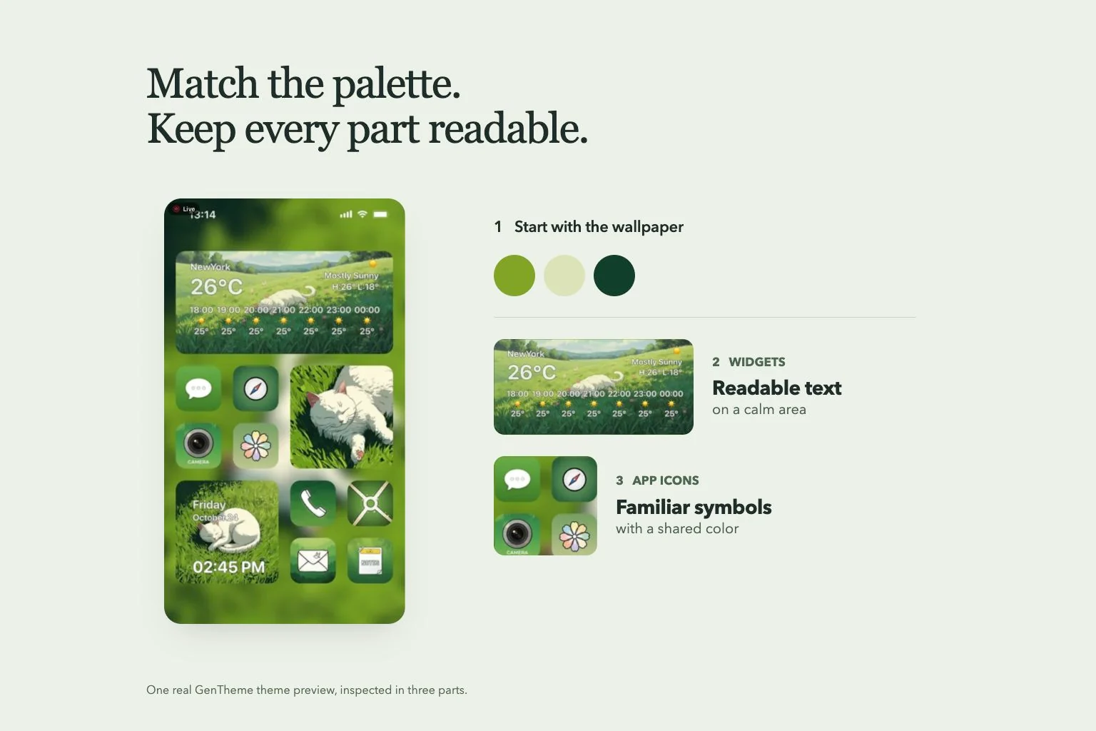
Gentheme’s Android icon flow adds selected shortcut images and asks you to choose their target apps. Inspect the pack against your selected wallpaper before applying. A common background tone or a consistent border can connect illustrated icons even when their symbols use different colors.
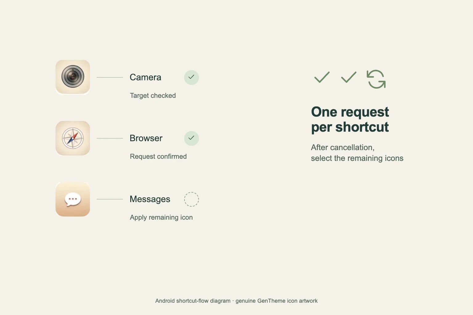
Confirm the shortcut requests and open the added icons to test their destinations. Place them together on one page for comparison. Check how your launcher displays these entries instead of assuming that a wallpaper palette will redraw downloaded icon images in exactly the same way as supported app icons.
Compare the finished page under one condition
Check the page with the same brightness and appearance setting while comparing palettes. Read app labels and look for icons that blend into the wallpaper. If the artwork disappears against a similar color, try a quieter background or a pack with a more distinct edge.
Change one setting at a time and keep a screenshot of the version you prefer. Replacing wallpaper, palette and icon pack together makes it difficult to identify why a page improved. Finish by testing a second page so the system color choice also suits apps outside the themed group.