 Gentheme
Pick one musical mood for the screen
A Taylor Swift wallpaper can hold a favorite performance memory, a gentle acoustic mood or a bold stage color. Choose the feeling before collecting several unrelated images. Your own concert photograph or original artwork can give the screen a personal point of view while keeping the composition simple.
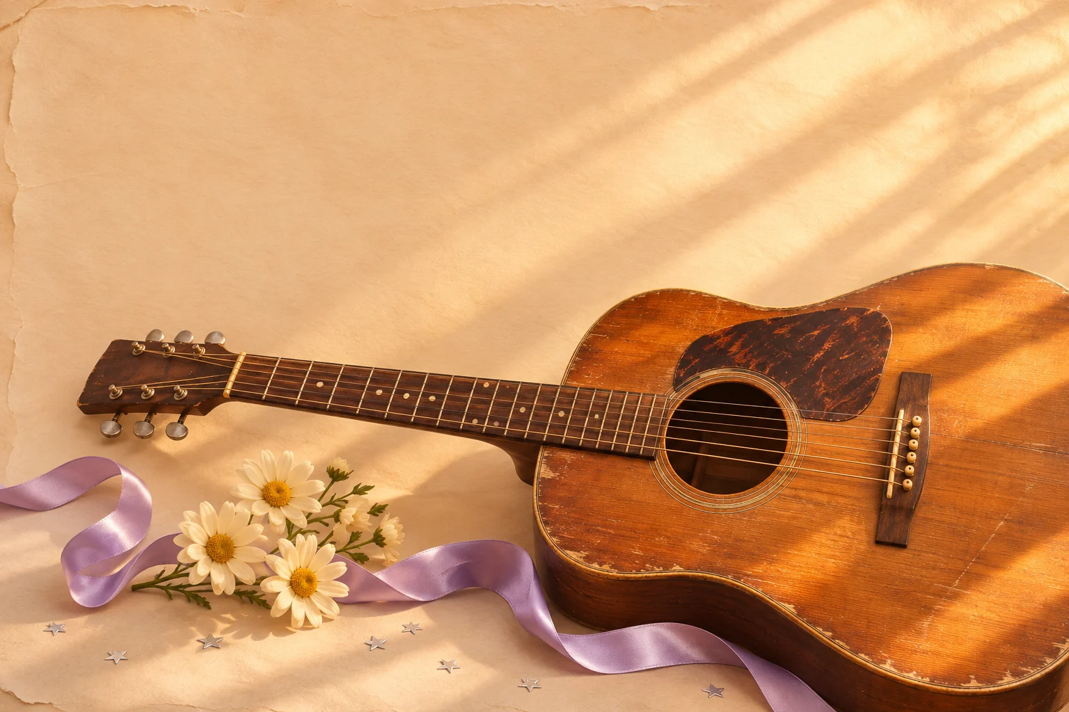
Try lavender shadows, cream paper and a small amount of warm gold for an acoustic direction. The example combines a guitar, daisies and a loose ribbon. Those materials create a connected scene with open space, so the wallpaper can suggest music even when you choose a version without a portrait.
Keep the face or instrument inside the crop
For a performance photograph, decide whether the expression, a hand on the guitar or the full silhouette matters most. Preview a portrait crop with that detail comfortably inside its edges. Leave extra room near the top so the system time does not cover the part that carries the memory.
If you use a flat-lay or collage, vary the scale of its pieces. One larger guitar or photograph can anchor the design, with smaller ribbon and star details around it. Keep any writing in a separate area from the clock and check every word after the image has been fitted.
Repeat the palette across widgets and icons
A lavender Home Screen companion can use a broad quiet field and a small warm highlight. Place the most detailed image on the screen where it has room. Compare the actual app grid with the background before choosing several decorative widgets that might cover the detail you enjoy.
Cream icon tiles with darker symbols can connect with the paper texture. Use one small photo-style widget if you want another personal detail, then leave enough space between its border and nearby apps. Keep familiar app positions while you assess the new colors during everyday use.
Balance the small details against the open space
Compare the guitar, flowers and ribbon at phone size. Keep the guitar’s outline understandable, then decide which smaller piece adds something to the scene. A ribbon can guide the eye toward the instrument, but several crossing loops can turn into an indistinct patch when the artwork is reduced.
Turn attention to the cream paper and lavender background as well as the objects. These quiet areas carry the spacing that makes the arrangement feel intentional. Preview the clock and a few familiar labels over them, then inspect the artwork alone to check that its warmth and acoustic character still come through.