 Gentheme

Choose one cinematic moment
A movie poster wallpaper can center on a lone silhouette, a doorway or a dramatic landscape. Start with an image you can use, or make an original cinematic composition. Choose the visual moment before adding several characters, symbols and lines of lettering that all need room on the same screen.
Try a small figure beneath a large illuminated arch with fog stretching into the distance. The example uses an original imagined scene with no movie title. Its contrast between the doorway and surrounding darkness gives the image a clear focal point even when the phone shows a narrow central crop.
Protect the subject and its surrounding clues
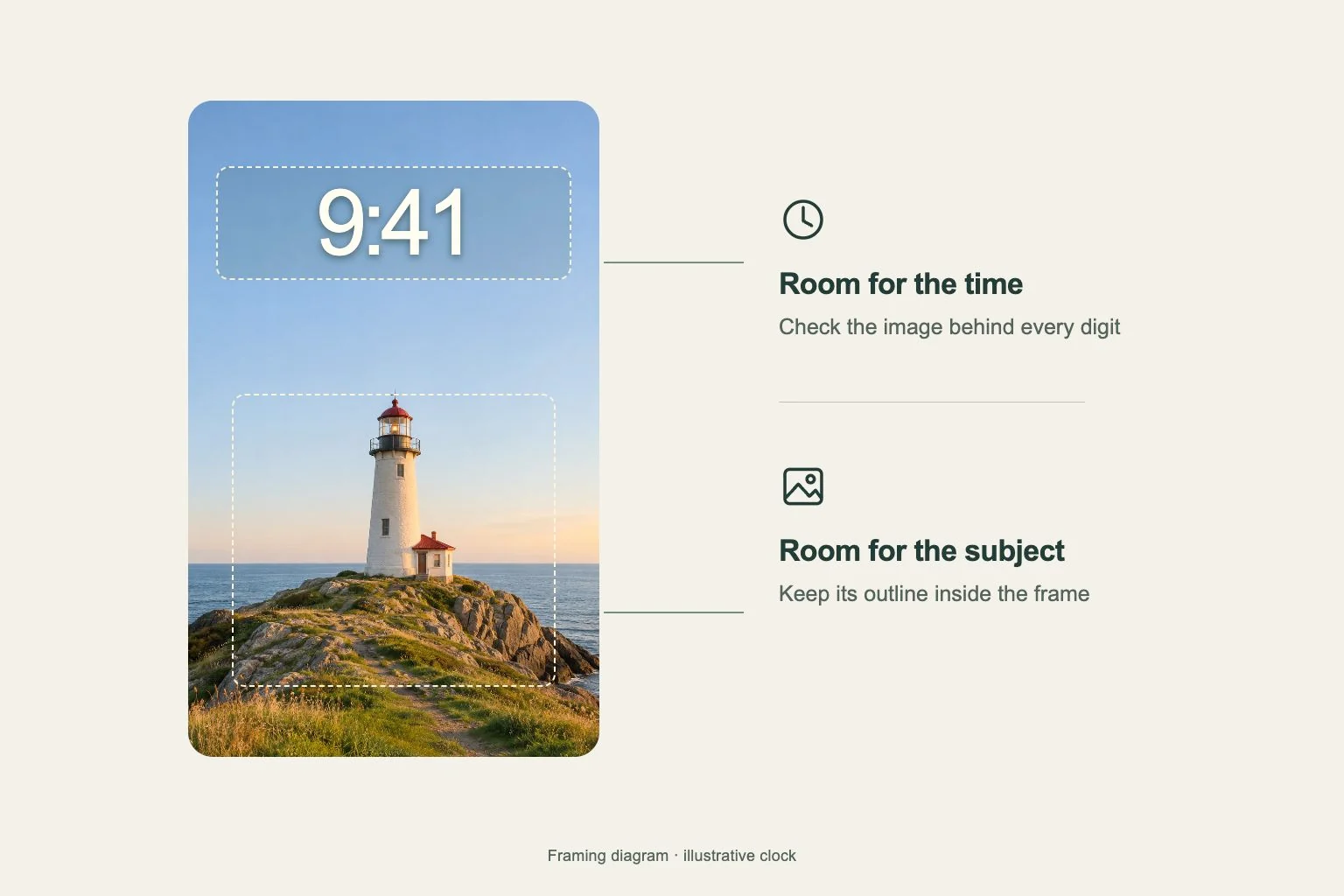
Preview the poster in the wallpaper frame and check what disappears at the edges. Keep enough of the arch, landscape or silhouette to explain the scene. A close crop can preserve a face while losing the setting that made the poster meaningful, so compare the whole composition after every adjustment.
If the source includes a title, inspect the complete wording after fitting it. Put decorative lettering away from the live clock and leave breathing room around both. Very small credits usually become unreadable on a phone, so consider artwork with fewer text elements when choosing the source.
Give the app page a different amount of detail
The full cinematic image may suit the Lock Screen, while its dark fog or one background color can support a busier Home Screen. Connect the pair through light and color. Keep the image’s brightest doorway away from app names that need an even background to stay readable.
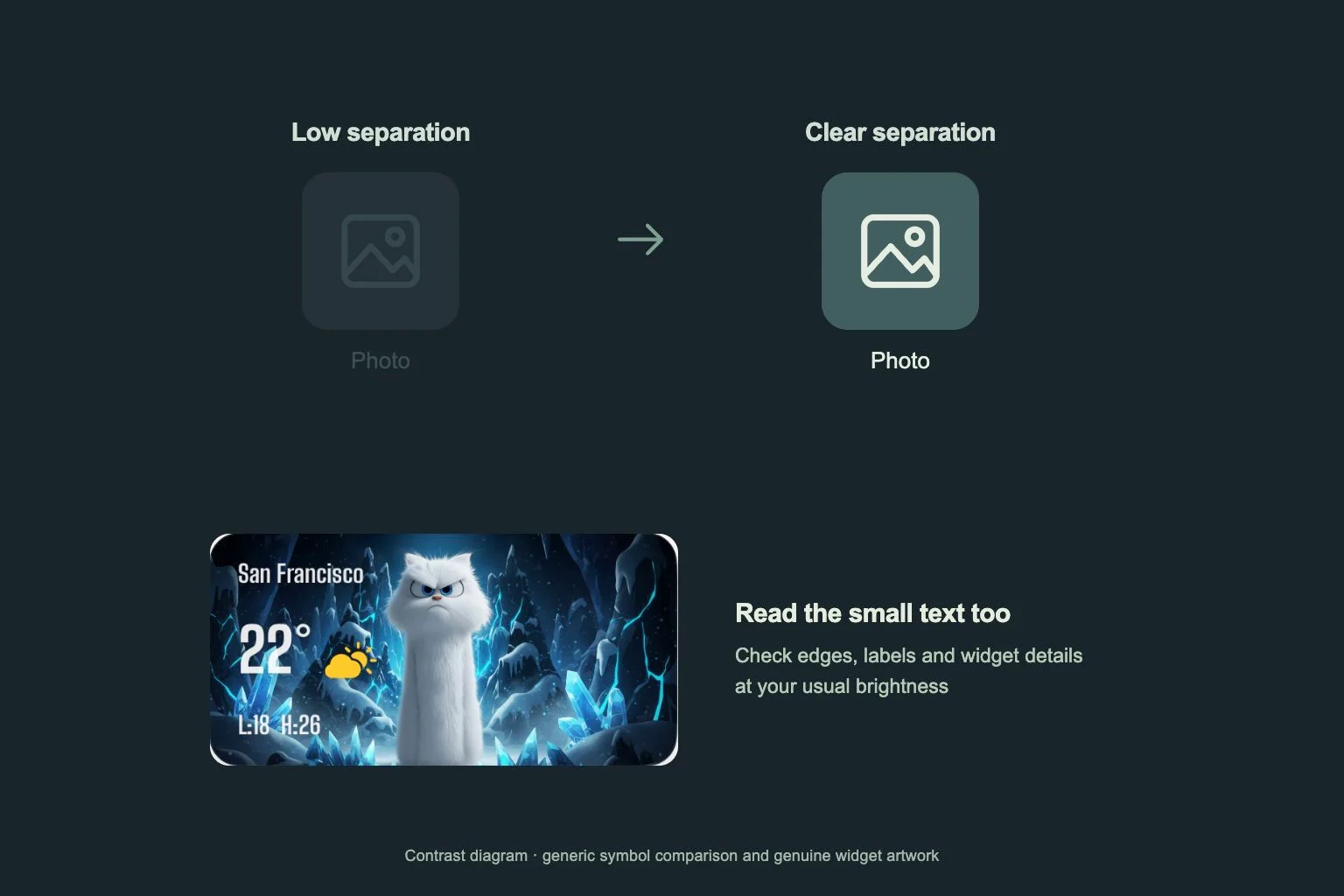
For icons, repeat one accent from the scene and inspect the symbols at actual size. A dramatic black-and-gold palette can still work with familiar app shapes. Add a widget where it provides useful information, then check whether its border competes with the poster’s strongest line.
Review the scene at everyday size
View the poster at the distance you normally hold your phone. Follow the figure, the arch and the path through the fog in that order, then look away and return to the picture. The main silhouette should still be easy to find without searching through the darker edges or the smallest architectural details.
Compare the composition with the clock visible and with a short notification over its lower portion. Look for a crop that keeps the entrance and the figure connected. If their relationship disappears, return a little surrounding space and review the whole scene, including the dark areas that give the bright arch its scale.