 Gentheme

Choose the group view or one solo moment
Before choosing a K-pop wallpaper, decide whether the whole group or a single performer should lead the page. A wide group photograph carries relationships between people, while a close solo image carries an expression. Choose a source you can use and keep its original resolution available for cropping.
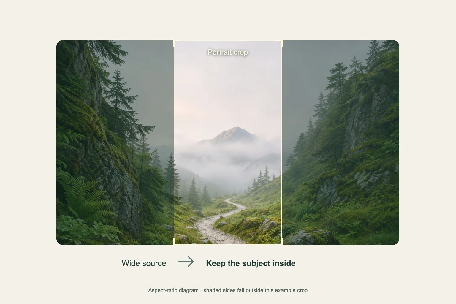
For a group, look for a frame where the faces are separated and the outer members have space beside them. The original illustration here uses four fictional performers to show that spacing. A narrow phone crop needs additional margin, even when the full photograph looks balanced on a larger screen.
Test the outer faces first
Open the wallpaper preview and inspect the people nearest both edges before zooming in. Keep their hair and shoulders inside the frame where possible. If fitting everyone makes the faces too small, try a different group arrangement rather than stretching the image or removing important parts of the scene.
For a solo image, leave space in the direction of the gaze. Put the brightest stage beam away from the clock and avoid a sharp light cutting through the eyes. On a wide tablet or foldable display, review the full group again because the visible height can change with orientation.
Choose how much fandom detail the app page needs
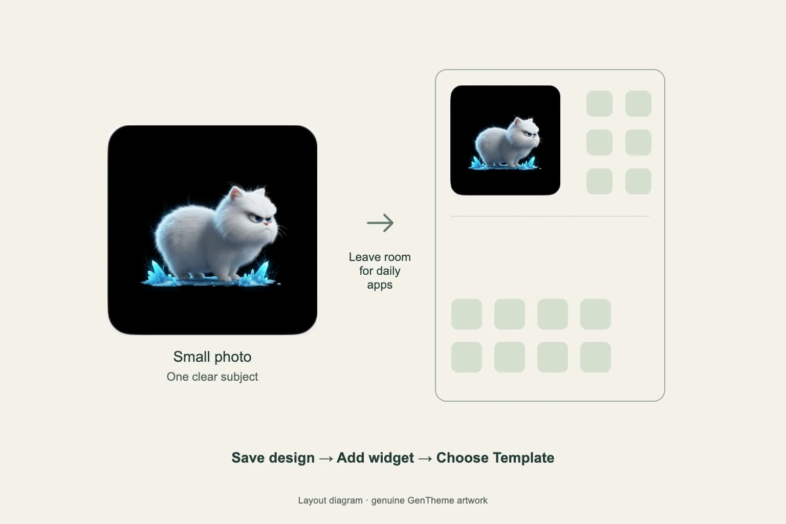
A busy stage with lights, confetti and several outfits can compete with app labels. Try a companion wallpaper using one of the scene’s violet or blue tones. Keep a small group image in an available photo-style widget if that fits the device’s grid and the information you need.
When choosing matching icons, preserve distinct symbols for your usual apps. A repeated accent can coordinate the page without making every app tile identical. Check badge visibility and folder names, then compare the result with the page you normally use to see whether navigation still feels familiar.
Review the group as a complete composition
Reduce the picture to the size of your screen and count the visible faces before examining individual details. Compare the space around the two outer performers with the gaps in the center. If the edge members feel crowded, a wider source or a closer arrangement within the photograph can give the group a more balanced frame.
Look again with the clock and a typical notification visible. Check whether a bright beam, raised hand or line of confetti crosses an important expression. Keep the group’s rhythm in view as you assess those overlaps, so solving one obstruction preserves the stage energy and the relationship between the performers.