 Gentheme
Choose the dawn atmosphere
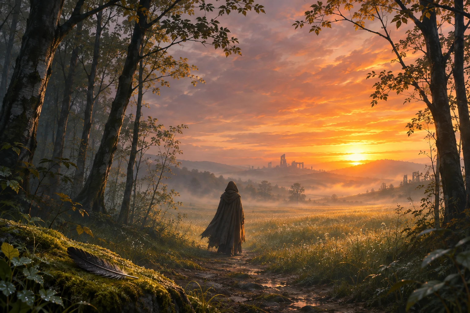
A wallpaper inspired by The Hunger Games: Sunrise on the Reaping can begin with morning light, forest shadows and the feeling of an uncertain path. Choose one visual relationship before adding several symbolic details. A broad landscape with one small figure can create a clear mood without needing to explain a story.
The original scene here uses a cloaked back-view silhouette, a dark feather and a meadow opening toward a gold sunrise. It is a design study with an imagined setting. Look at how the warm light connects distant layers while the dark trunks keep the outer edges visually grounded.
Leave room around the path and silhouette
In a portrait crop, keep the path’s entrance and enough ground under the figure to explain where the person stands. A close crop can remove the route that leads into the picture. Trace the path from the lower edge toward the light before deciding how much of the sides to trim.
Check the figure against the field behind it. A dark cloak can merge with a trunk if their outlines touch, while a bright sky can erase a small head shape. Move the frame slightly to compare the silhouette with both surroundings and preserve a clear separation at everyday size.
Keep the time separate from the sunrise
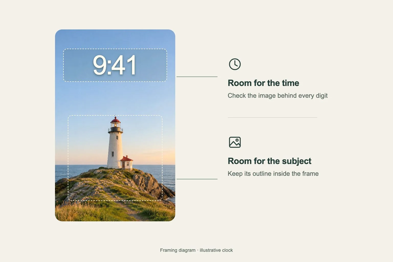
The brightest gold area can be a strong focal point, but placing pale time numerals directly over it may reduce contrast. Try a clock position over an even gray or warm midtone and compare the complete date line too. A branch passing through one letter can be more distracting than the larger scene.
A calmer Home Screen companion can carry the forest’s muted olive and one small gold edge. Choose icon surfaces that keep app names readable, then inspect a widget’s secondary text. Let the dawn image hold the dramatic contrast while the practical page uses a steadier amount of detail.
Compare the mood after cropping
View the source and the proposed phone frame side by side. Check the balance of golden sky, cool forest and the small figure. If the feather disappears, decide whether it is essential to your chosen composition before enlarging the entire image and losing the wider landscape.
Add the clock and notifications to the preview, then read the page from your usual distance. Review a second frame for a wide screen, where more trees may become visible and the path may shift. Keep the version that preserves the atmosphere and a useful place for daily screen elements.