 Gentheme

Choose what makes the team feel connected
An Avengers: Doomsday-inspired wallpaper brings several visual identities onto the same screen. Start by deciding whether you want a full ensemble, one favorite hero or a color-led composition that suggests the team. Each choice needs a different amount of detail, so choose that role before collecting several equally large portraits.
The original palette concept combines red-and-gold metal, a blue circular form, green stone and crimson fabric against a dark field. Their different shapes demonstrate how a group can stay readable while sharing one lighting direction. You can use that principle with character artwork you have permission to use.
Give one figure the visual lead
In an ensemble image, look for one larger anchor and a few supporting silhouettes. Keep a small gap between heads, shoulders and important props so the outlines remain understandable at phone size. A crowded row of faces may need more width than a narrow wallpaper frame can offer.
Test the outermost figures first in the system preview. Check whether the crop removes a hand, a shield edge or the cape that helps identify a silhouette. On a wider screen, review the top and bottom as well, since the same image can reveal more width while losing some vertical context.
Use the team colors in smaller amounts
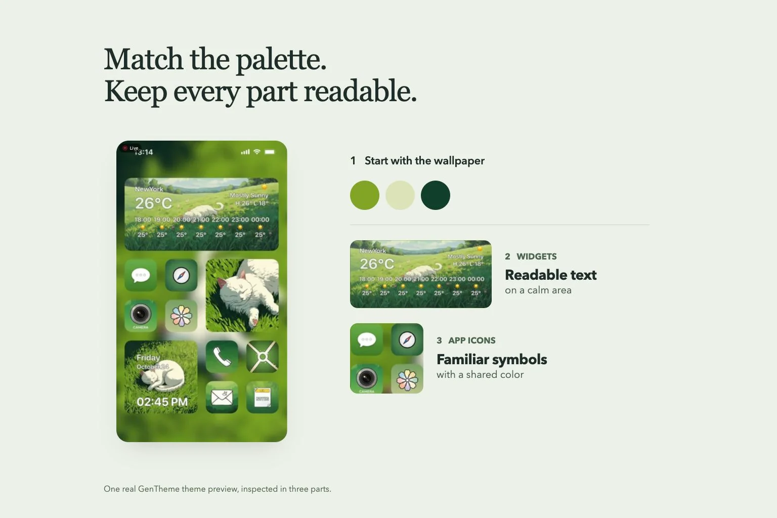
For the Home Screen, choose one dark blue or charcoal base and repeat only a few accents from the image. Red, gold, blue and green can all belong to the same palette without occupying equal areas. Leave the central app grid calmer than a detailed ensemble poster.
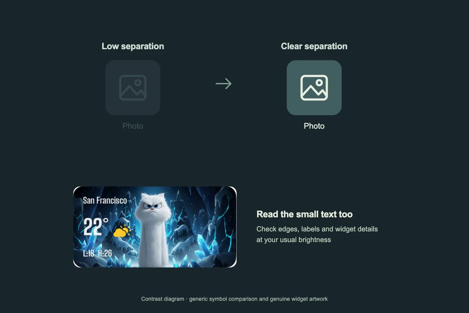
Choose icon symbols you can recognize even when several tiles share a color. A widget can repeat one metallic or fabric accent, but its text still needs a readable surface. Compare small dates and secondary labels at your usual brightness before adding another decorative panel to the page.
Review the ensemble at the size you will see
Compare the complete artwork with the narrow frame you plan to use. Check the space between silhouettes and the balance of red, gold, blue and green. A color-led companion can preserve the group’s visual identity when the whole ensemble becomes too small to read on an app-heavy page.
Inspect the group outline with the clock and notifications present, then read everyday app names and widget text at your usual distance. If one figure keeps being hidden, compare a different source arrangement or give the detailed ensemble the screen with more open space. Keep each comparison focused on one change.